Overview
HudsonAlpha Institute for Biotechnology is a genomics-based research institute.Their vision was to build a Genomic Health Exchange (GHE), a healthcare platform that connects doctors, patients, counselors and labs to seamlessly provide rich clinical genomic health information. Additionally, they wanted to provide an approachable and engaging education platform.
Tools
Figma, Sketch, InVision
Team
Nicholas Pirolo
My Role
Discovery & Analysis:
Existing Product Audit, Competitive Analysis, Kick-off Workshop
Ideation and Synthesis:
Personas, Workflow Modeling, UX Themes, Info. Architecture, Wireframes, Features & Concept creation
Visual Design:
Moodboards, Visual Concepts, Unique Screen Designs, Style Guide, Component Library
Client
HudsonAlpha
14 min read
About the Clients
About the Clients
HudsonAlpha Institute for Biotechnology is a genomics-based research institute. It is a nonprofit institute where scientists, educators, and entrepreneurs translate the power of genomics into real world results.
This project focused on identifying the most impactful flows and tasks for Patients, Health Care Providers and Program Managers; while understanding of the greater ecosystem of users and systems involved.
Offering “just-in-time” guidance and education to help providers navigate test results with their patients
1
Providing curated resources to enable patients to further explore their personal genomic health discovery
2
Creating a seamless onboarding while being HIPAA and FDA compliant
3
4
Cultivating an engaging user-facing experience
Creating a sense of trust, where patients feel that their data is safe and private
5
Challenges
Not many patients or providers are well-informed about genetics, so there is a lot of uncertainty or misunderstandings about it
1
Test results can take up to 90 days to receive. By then, the patient may have forgotten or lost interest.
2
Providers have very limited time to dedicate per patient
3
4
HIPAA, consent, and other legal regulations make the interactions clunky, complex

Process
Material Immersion


Competitive Audit
We started looking at the competitors in this filed to get acquainted with the artifacts, nomenclature and content that was part of the genomics world.
Collaborative Workshop
The team hosted HudsonAlpha in their office to facilitate a collaborative workshop. Through this we were able to align on the goals of the project, the problems at hand and areas to focus our efforts.


Research & Material Immersion
We immersed ourselves in the materials the client shared with us to get acquainted with the business and the artifacts involved .
The most important document here are the Genetic Reports that the clients shared.
Ideation & Synthesis
User Personas
We identified user personas and their keys tasks/ abilities that need to be supported by the application.
1) Patient
2) Provider
3) Program Manager


Key Flows
After working with the HudsonAlpha team, we identified 3 key user flows that will be focused upon for the duration of the project.
1) Onboarding
2) Tests Results
3) Education
UX Principles
For each of the key flows listed in the previous slide, Momentum identified UX Principles that will be used to inform ideation and design.
1) Simplify
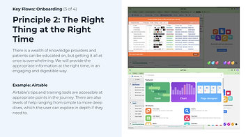
2) Right Thing at the Right Time
3) Digitize
4) Address the Unknown
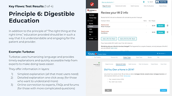
5) Digestible Education
6) Interactive Data
7) Ease of Scheduling
.png)
.png)
.png)
.png)


Information Architecture
A preliminary information architecture was developed after the collaborative workshop and was further refined after feedback was captured during the wireframing.
Wireframe Sprints
Desktop
Mid-fidelity wireframes were created on Figma after initial ideation and brainstorming. These wireframes went through several iterations of refinement as the team got more clarity on the concepts and client vision.


Mobile
After establishing the desktop wireframes, we moved to mobile wireframes. We went through iterations over the different navigation systems in order to make it intuitive and simple.


Visual Design
After the wireframe sprints, the team was to move into the visual design phase. In order to have a smooth transition and a better understanding of HudsonAlpha’s vision, the team put together a moodboard as a conversation starter for visual design.
This moodboard is a compilation of different icon styles, shapes, backgrounds, buttons, motions, etc. It also consisted of inspiration pictures shared by HudsonAlpha.


Style Tiles
After walking HudsonAlpha through the moodboards, the team presented them with three different visual treatments to get their views on icons, colors, typography, button styles and other visual components. This exercise was extremely helpful and informed the first visual concept.
Visual Design Concept I
After the establishing the style direction, the team presented first round of visual concept of which, the blue concept was selected.


Visual Design Concept II
After incorporating feedback for the Concept 1, the team produced Concept 2 with different components treatments. This was well received by the clients and marked the visual style for the application.


Key Screens
Desktop


Mobile
Features
Education
UX Principles ‘Right thing at the Right time’, ‘Digestible Education’ and ‘Interactive Data’ were applied here to enable multiple layers of education by clicking into jargons/ concepts to understand them better, having an education portal where users can access curated articles and posts for them.


Messaging
With ‘Ease of Scheduling’ as a UX Principle, the team wanted to enable users to have means to quickly resolve any form of roadblocks in their experience by being able to raise across multiple locations and with concerned parties.


Family Tree
Family tree was an interesting function which was completely revolutionized by the team. There were several design challenges such as different states of a family member could be in (living, deceased, adopted, etc) and the ability to see the multiple medical conditions using tags for each of the conditions selected.


Program Manager
The team received a scope extension to create high fidelity screens for the Program Manager. We focussed on 3 keyflows:
1) Dashboard flow
2) Customize eTRF flow
3) Customize Survey flow


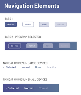
Style Guide & Handoff
Design specs, screen states, and components were shared with the client for development.