
Niido
powered by Airbnb
Overview
Niido is an Airbnb friendly, real estate company that owns and operates both long-term and short home sharing units. The business was being supported through an internal product. Seeing a gap in the market, Niido wanted to redesign and develop this tool into a viable and desirable Saas product while gaining "first mover" advantage.
My Role
Discovery & Analysis:
Existing Product Audit, 8 User Interviews, Comparative Analysis, Co-Creation Workshop
Ideation and Synthesis:
Workflow Modeling, UX Themes, Info. Architecture, Wireframes
Usability Testing & Solution Validation:
6 Participants Design Iterations & Improvements
Visual Design:
Concepts, Unique Screen Designs, Style Guide, Component Library
Tools
Sketch, InVision
Team
Nicholas Pirolo, Vanessa Fahy
Client
Siight, Niido
About the Clients
Niido is a real estate company that offers short and long term rentals, and supports home-sharing in partnership with Airbnb.
This business model is targeted to travelers and enables them to rent their space in order to offset their rent or pay for their next trip.

Product, before.


Process
Pre-Kickoff Client Questionnaire
Before kicking off the project we put together a series of questions via a Google sheet that would help inform us about the project. Questions were related to goals, vision, users, success metrics, competitors, etc.


Product Audit
We accessed the current Niido Hub to track the overall information architecture and frequent user workflows. This helped us to both inform and understand our other research endeavors. One of the key takeaway was the Information Architecture, which was a complete mess given that content was being added on an adhoc basis.
User Interviews
The team and I conducted interviews with 8 active users across 3 locations. We drafted discussion guides to expose the task flows, goals, and struggles using the product as well as in their general work.


User Flows
From our interviews the team and I identified several workflows that were still ambiguous. We mapped out these flows to be used as a conversation reference with users and stakeholders.
Co-Creation Workshop
The team traveled to Niido’s Miami offices to present and validate findings with both key stakeholders and end users. In addition, the design team created and facilitated collaborative exercises to better understand business goals, user workflows, and the future of Niido Hub, now Siight.


Users
From the user interviews and co-creation workshop I was able to identify three unique user groups and four supportive roles. For each; goals, tasks, challenges, usage, and opportunities were tracked.
Operation Hosts
Responsible for day to day operations of Airbnb homes including reservation management and unit preparation.
Strategic Hosts
Holds a managerial role that builds a community with Resident Hosts and stays closely linked with corporate strategy
Corporate Finance
Maintains communication, uniformity, and data integrity across all properties.
Supportive Roles
Non-active users who inform or support workflows found within the Hub.
2
Info at your fingertips
3
See it from a New Perspective
4
Connecting with Others
Experience Brief
We created an experience brief to summarize discovery analysis and give a high-level vision of the future.
The brief included 4 UX principles used to inform ideation and design. The team also discovered future opportunities for the product that were not in the scope of work.
1
The Right Thing at the Right Time
Workflows & Feature Definition
Through iterative process the team and I grouped and prioritized content and features based on known user workflows. This became the foundation for user interface design and supported quick and effective task flow completion.

Primary Content
Organizes information and features related to the daily workflow and common tasks of main user groups: Operation Hosts, Strategic Hosts, and Corporate Finance.

Secondary Content
Access point for less important or frequently used information. It addresses needs for our three main user groups, plus other corporate users while not disrupting the workflow in the Primary Content Area
Navigation & IA
The information architecture evolved as the team continued to iterate within the wireframe phase. Major content groupings remained consistent throughout design but as the team learned more, the more incremental changes were made to location, naming, and groupings of detailed features and content.


Concept Exploration
The team used a whiteboard to quickly sketch and articulate abstract ideas. This platform allowed for collaborative ideation and open discussion. By working this the team was able to try and ‘test’ divergent ideas in a short amount of time and helped to prepare and inform high-fidelity wireframes creation.
Wireframes & Feature Additions
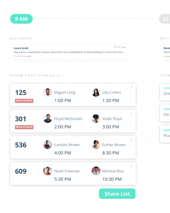
Bookings
Bookings is an example of a new area of the product that the team designed. The need to manage reservations and room statuses within the context of time was found to be imperative to a smooth operational workflow.


Reports
Reports is another example of a new area of the product that the team designed. Information relating to finance, bookings, resident status, and more existing only on very granular levels and scattered throughout the current product. The team redesigned how this content would be structured and added an “At a Glance” view for a lot of dense information.


Usability Testing & Solution Validation
The designs were tested in wireframe state with 6 participants, active users and non-active users. The team created a clickable prototype that was “real enough” along with a testing script that requested the completion on several tasks.
1. Nomenclatures needed to be more accurate and consistent
2. Original KPIs were not helpful, others were requested
3. Information architecture needed to be reworked to make more fluid user flows
4. UI components needed to be updated to make it more intuitive for the user

Visual Design Challenges & Direction
Since this product needed to be redesigned with the intention of it becoming a SAAS the visual design language of the current version needed to be discarded. The challenge here was that this new product did not have a brand or even a name. It was a total blank canvas for the team.
The original research on end users and business goals and values was used to inform the visual design direction. In order to make the design impactful yet desirable the team balanced intuitive UI design with emotions related to home-sharing and hospitality.


Style Guide & Handoff
Design specs, screen states, and components were shared with the client for development.

Client Feedback

